DANA
The Challenge
Events — from large scale international conferences to galas involve many moving parts: session and speaker logistics, AV cues, catering, volunteer coordination, and so on.
The challenge was to design a tool that simplifies the complexities of event planning and centralizes information - providing all the necessary features for team management while effectively communicating that with the public in a timely manner.
Key Pain Points
Use of multiple planning platforms create redundancy and confusion
Difficult to find (individual or team) responsibilities
Updates to public schedules aren't timely
Cross-team collaboration is difficult to maintain across multiple teams and channels
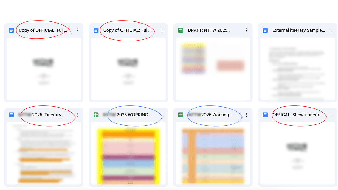
Real-time example of duplicated "Official" event schedules
How might we allow teams to execute large-scale events more efficiently?
THE PROCESS
Table of Contents
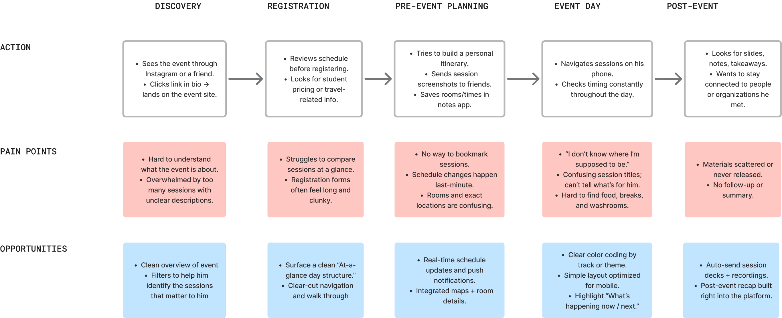
DISCOVERY
Understanding Two Groups of Users
I conducted qualitative interviews with event planners, organizers, and project managers to understand their workflows, frustrations, and mental models around building out schedules the event.
Then, I spoke with event attendees to understand how they interpret schedules, what confuses them, and what makes them feel prepared throughout an event.
Overall — many organizers described using multiple disconnected tools (Google Sheets, WhatsApp, PDFs, email threads) which often led to miscommunication and duplicated effort.
While attendees friction points are around unclear session details, schedule changes, and the lack of information for events.
Overall — Friction points around unclear session details, schedule changes, and the lack of information for event day.
Market Research
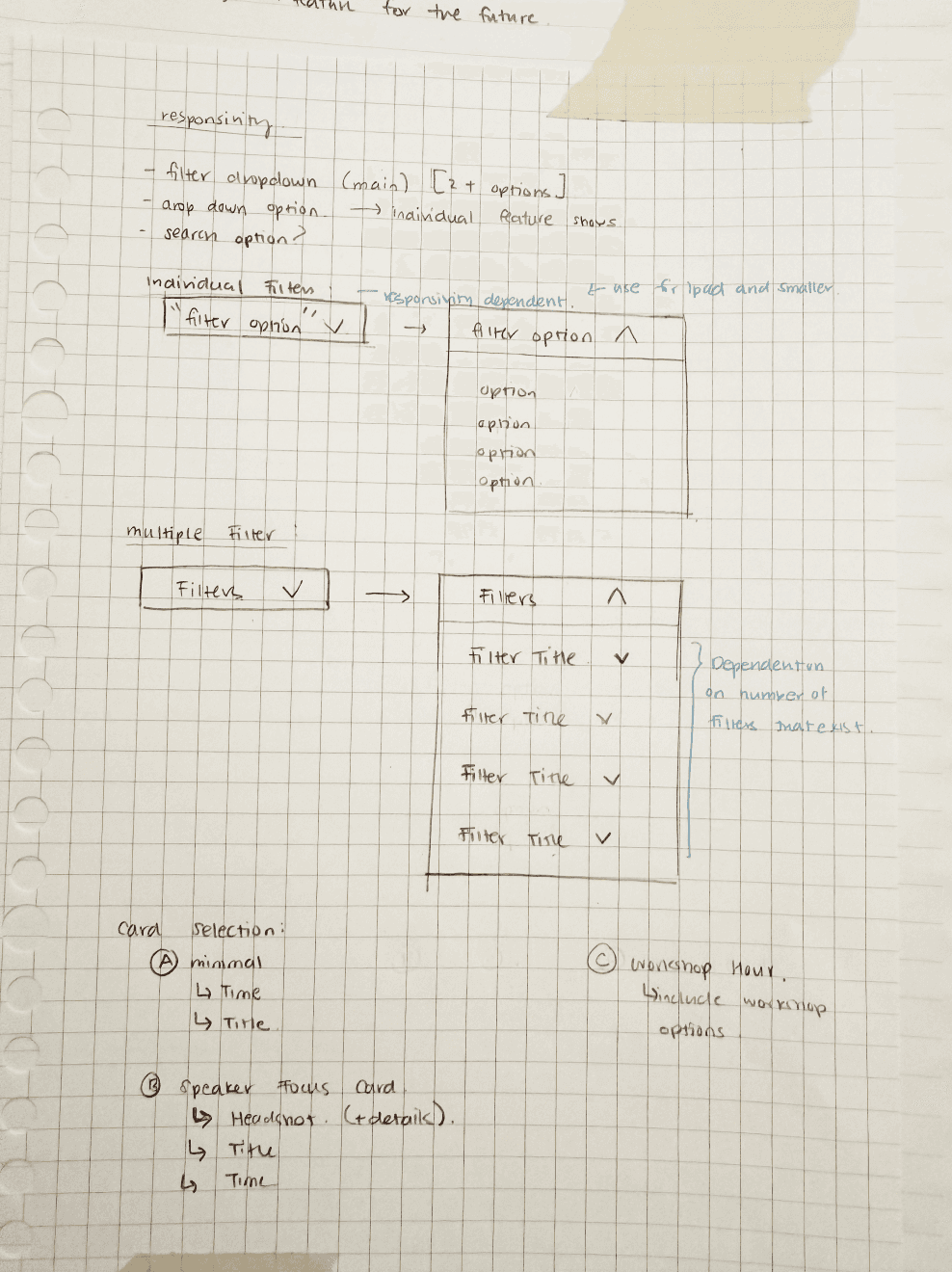
Diverse events of different scales and types, requires customized itineraries that are similar, but can contain different components (ie. filters, locations).
To understand how event itineraries are structured at scale, I analyzed a range of events, varying in scale, audience, and type.
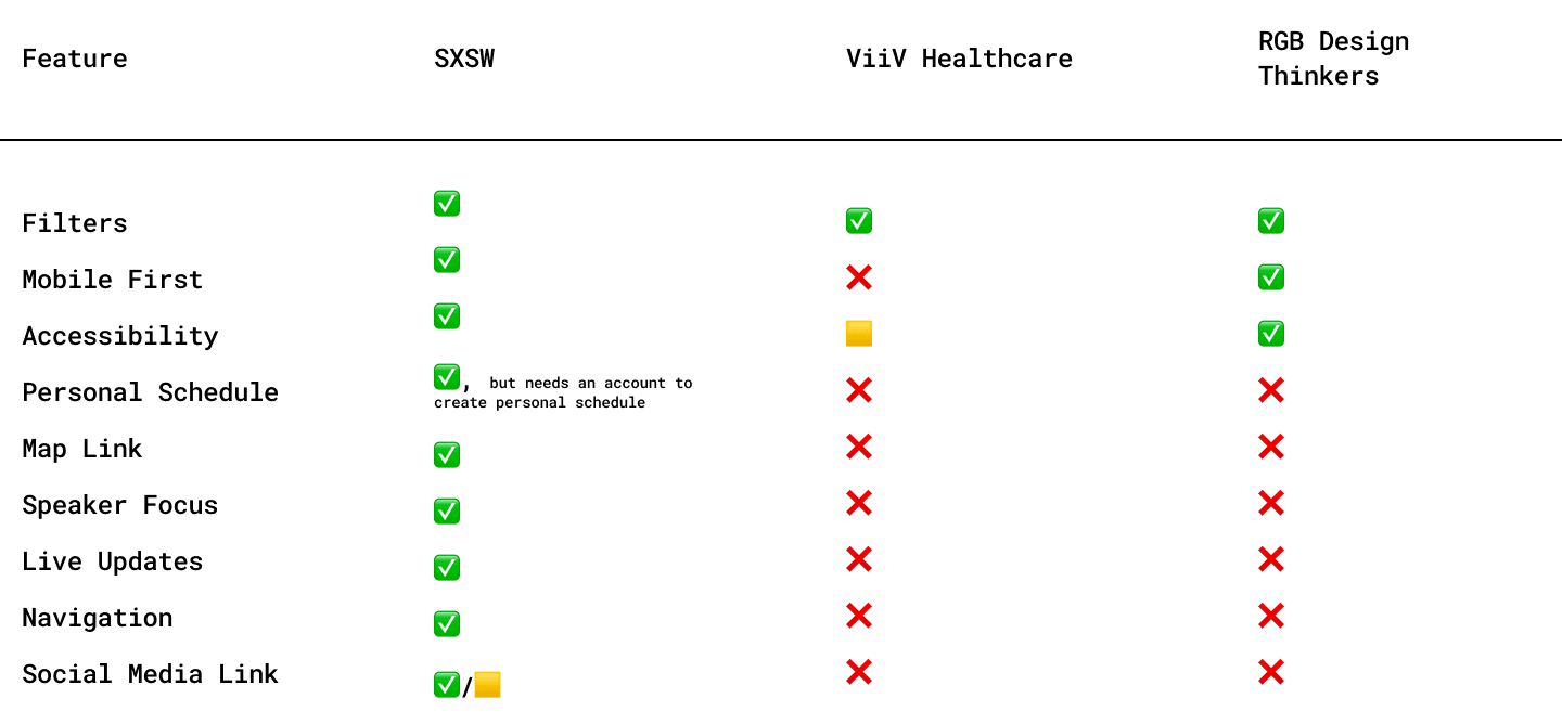
Key Insights
The overuse of filtering causes increased confusion and missed sessions
Showcasing sessions & speakers was one of the most fundamental features
Attendees find speaker information valuable
Allows the ability to follow/connect via social media
Improves credibility and opportunities to network
Users find value in having a personalized view of all of their agenda (ie. ability to bookmark)
Accessibility and mobile optimization seems to be a weakness across many platforms
Overall — There’s a gap between highly functional but visually heavy systems (like SXSW) and smaller scale, limited systems. My goal is to design a scalable itinerary that allows for both infrastructures.
DEFINE
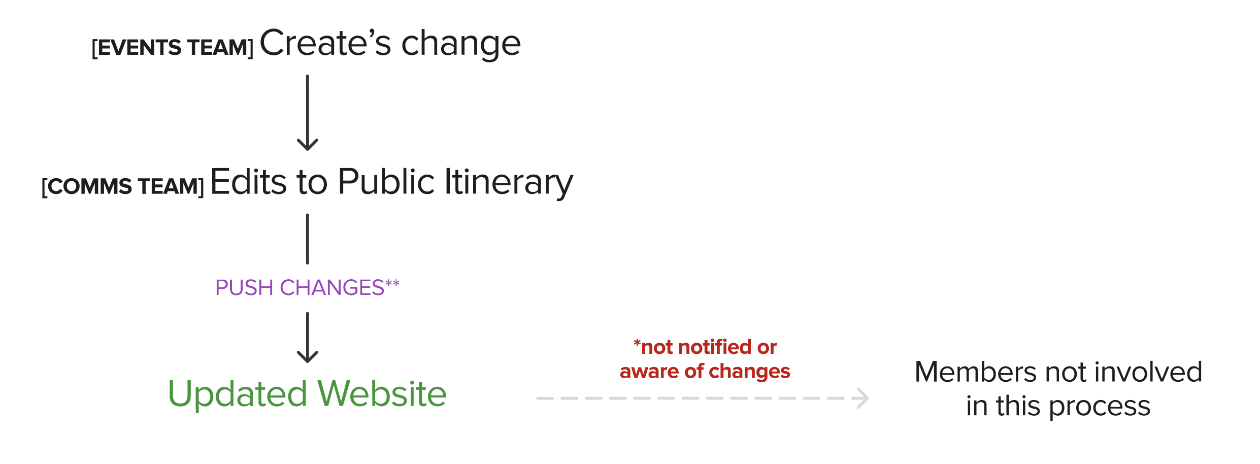
Event planners and organizers want synchronized ways to organize cross-team workflows so all team members are aware of any updates.
User Personas and User Journey Maps
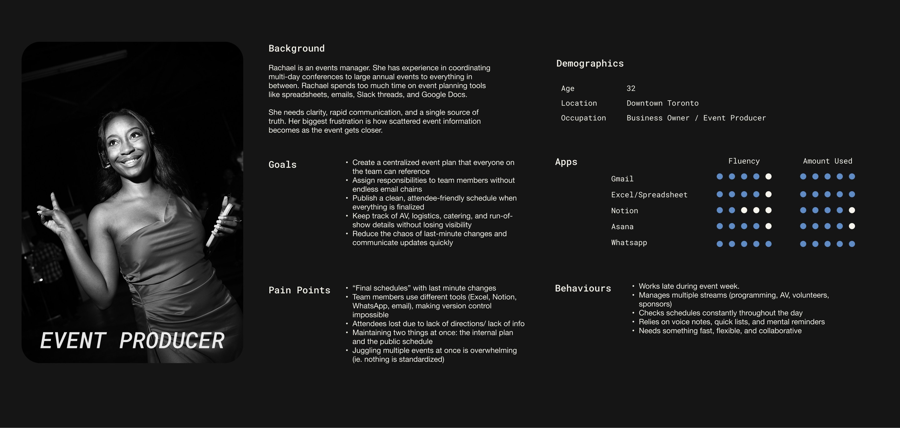
Organizer Persona
Attendee Persona
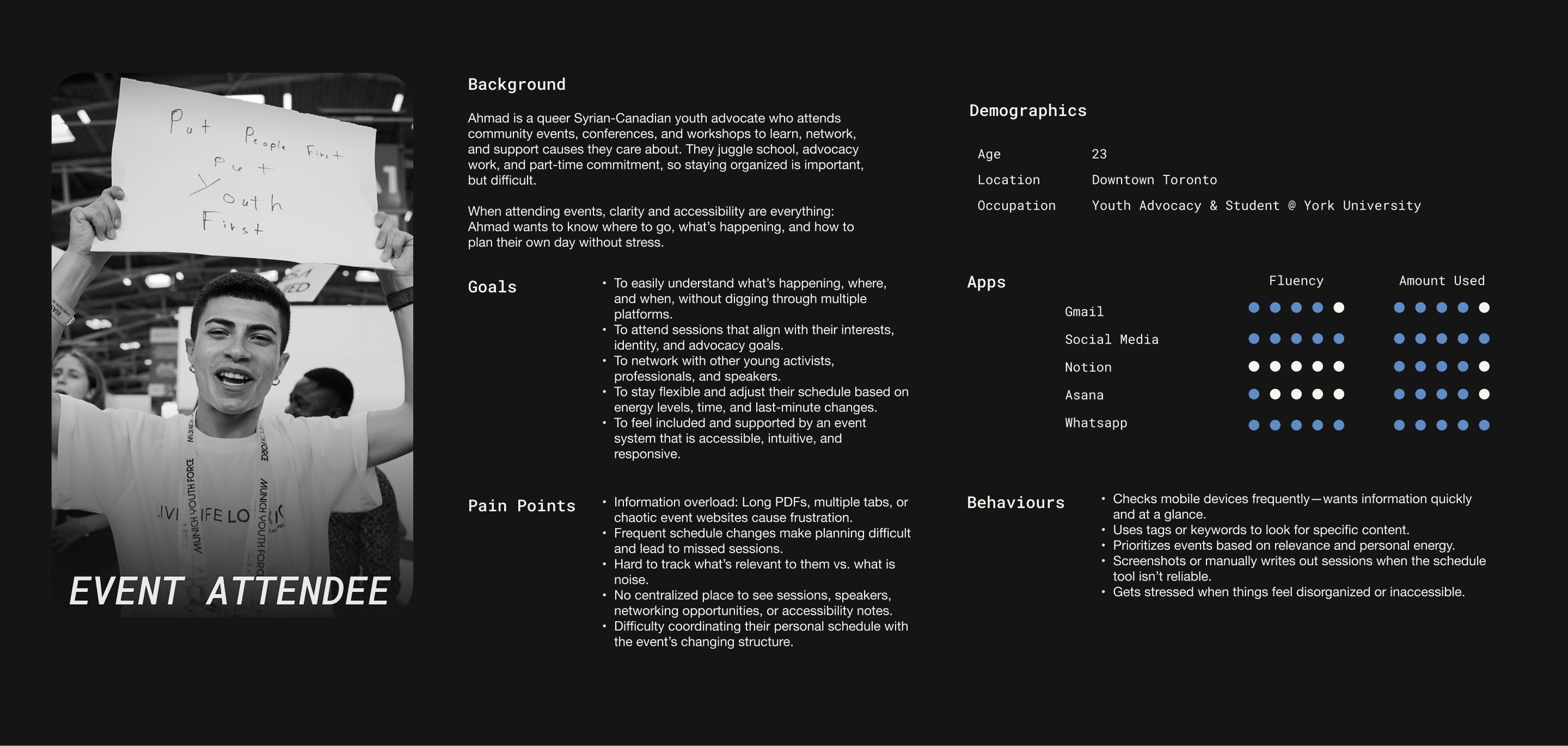
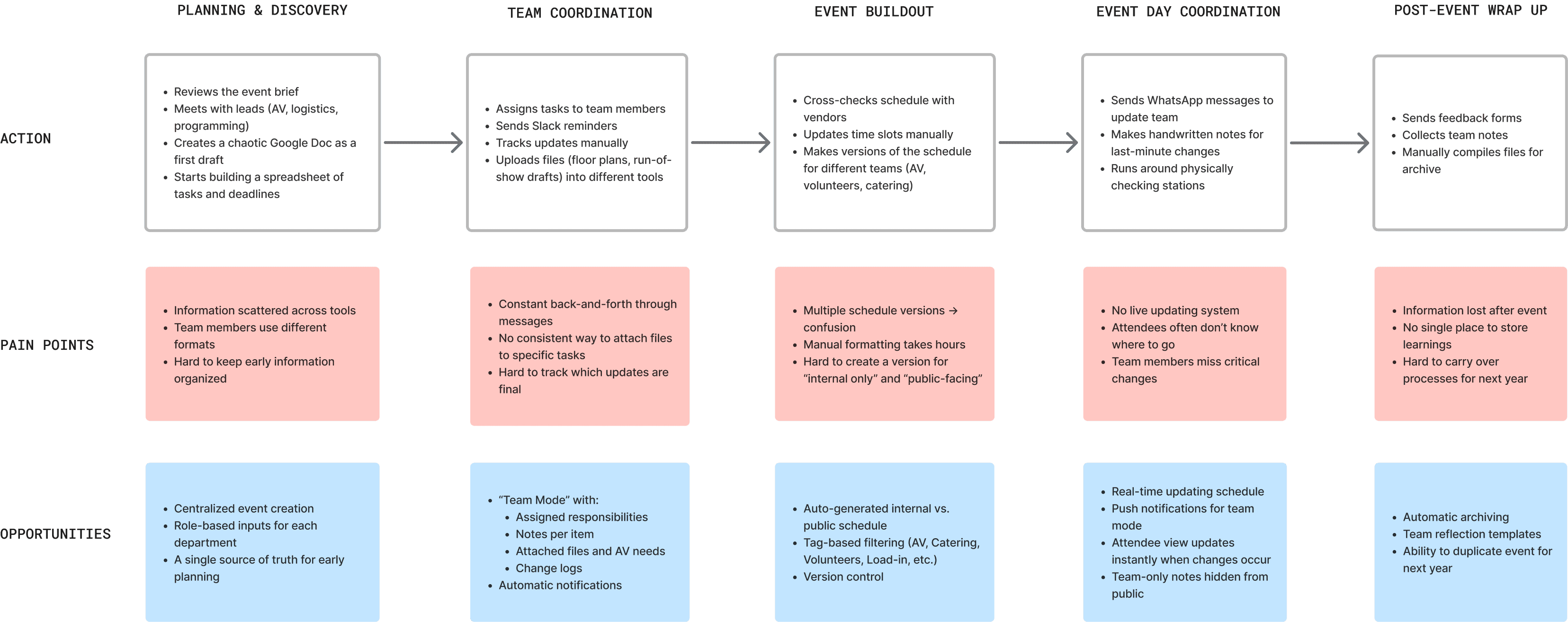
The user scenarios helped highlight moments where coordination often breaks down. It also guided critical design decisions around categorization, notification logic, and how information should be structured for two user groups.
For organizers, they need more customization and information details and for event attendees, they need a more filtered down view of the high level details.
Given these user insights…
IDEATE
CREATING THE FRAMEWORK
I focused on finding the elements needed to create a scalable system, by defining the atoms -> molecules -> organisms. This helped me to understanding fundamental user inputs.
Understanding the Input
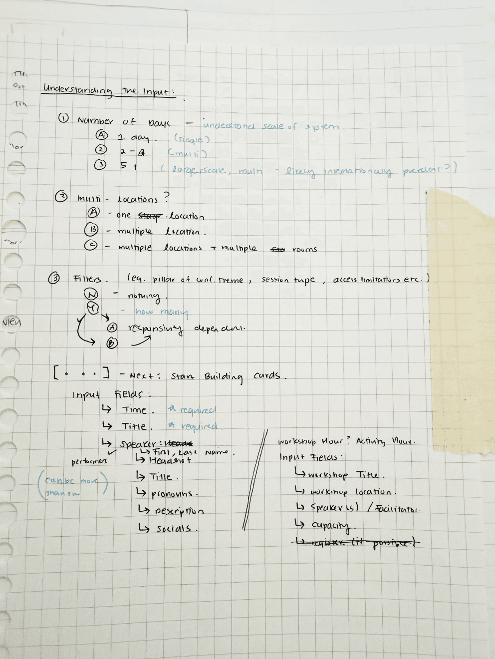
Storyboarding
Afterwards I set out to explore customization preferences such as filtering and schedule management.
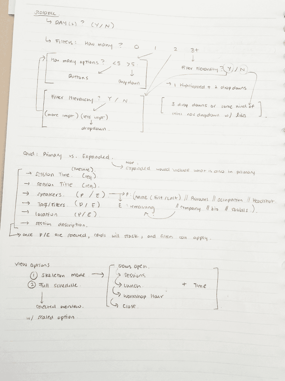
The core components of the system were: dates, speakers, and different inputs.
Planner-Participant Syncing
To bridge the gap between event planners and attendees, a multi-mode ecosystem with event planning & publishing an itinerary became the solution.
The concept of planner-participant syncing emerged as a way to separate internal planning from public-facing experiences while keeping them connected through a shared system.
Content Governance
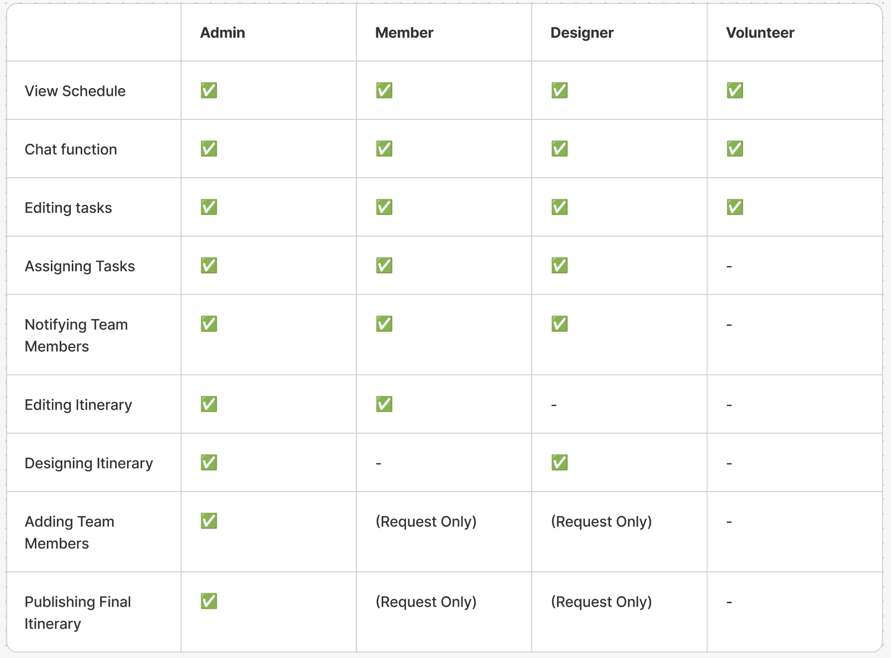
Large scale teams need to control how content is created, reviewed and published.
Creating access tiers prevents accidental updates to the public,reduces redundant edits and unintentional updates.This architecture enforces role-based permissions, separation of concerns, and accountability, while maintaining a single source of truth.
Hierarchal Access
Storyboarding Continued.
Cross Mode Syncing
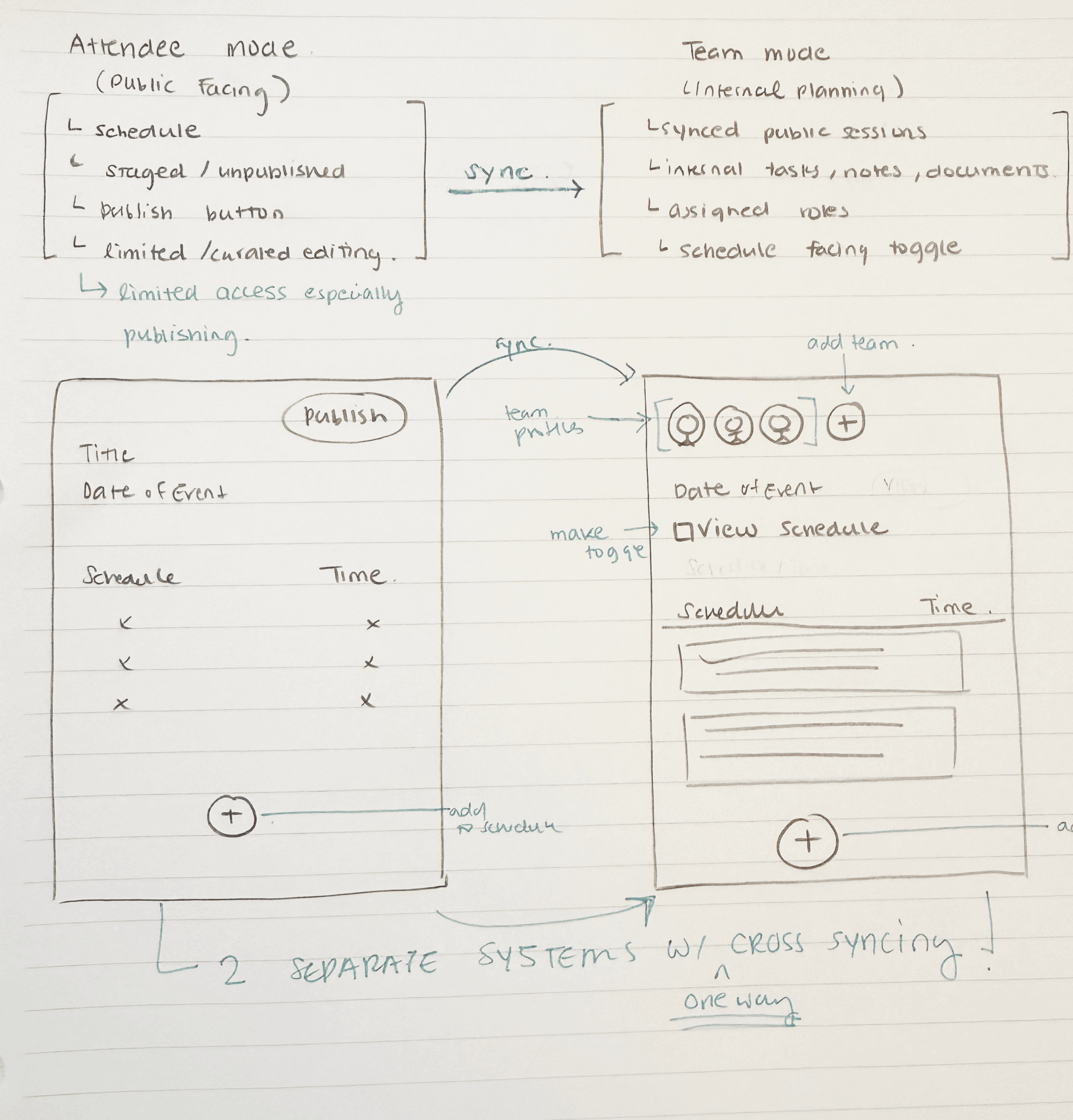
By combining hierarchical access, cross-mode syncing, and governance workflows, EventFlow supports complex, multi-day events with clarity, flexibility, and reliability.
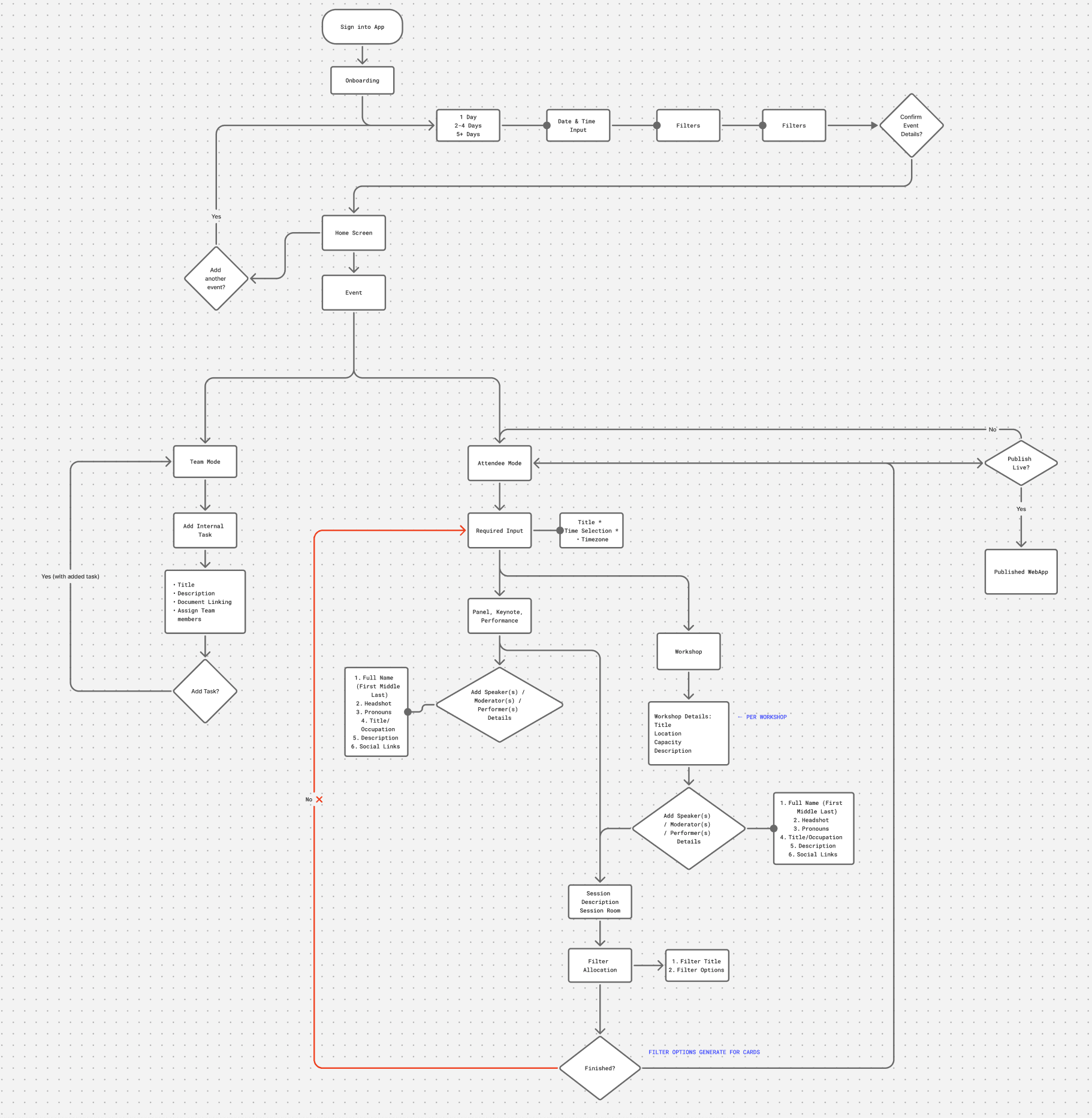
User Flow
This user flow served as a blueprint for wireframes and prototypes which needed to be multi-layered, intuitive and scalable.
WIREFRAMING & PROTOTYPING
ONBOARDING SCREENS
ONBOARDING
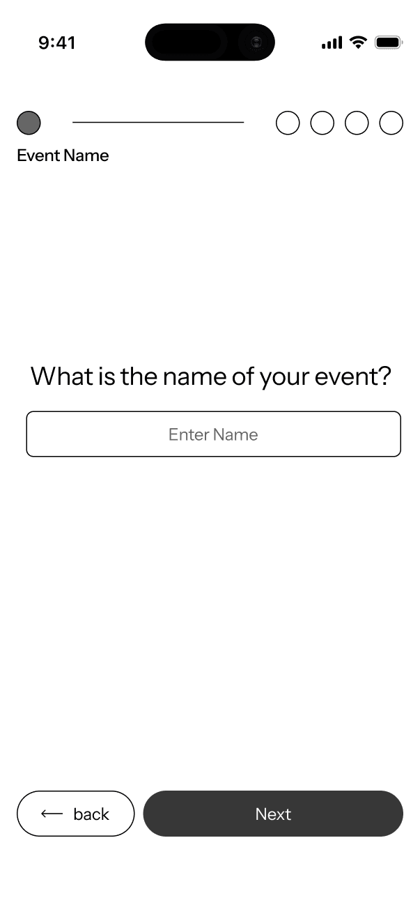
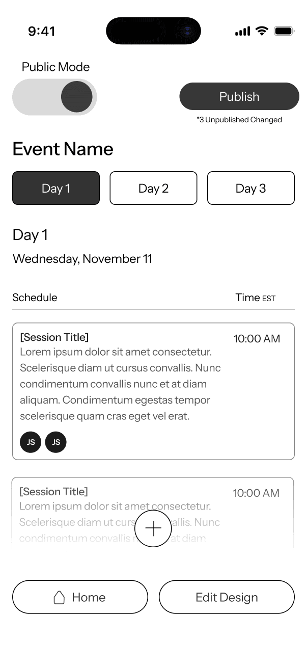
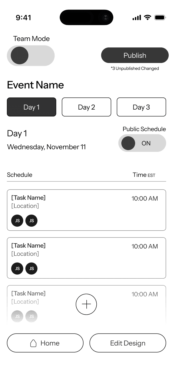
DASHBOARD
Public/Team Toggle : easy switch between the two interfaces
Publish CTA (limited ability based off rights)
Event editing
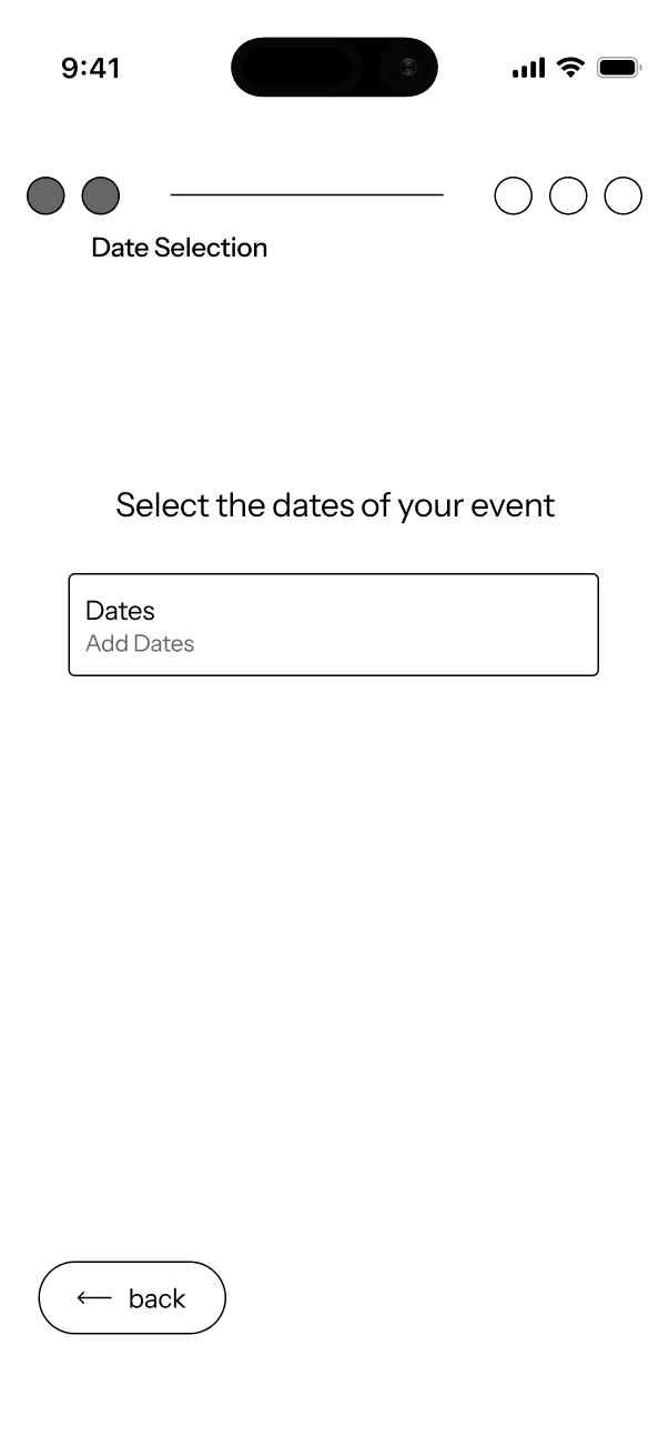
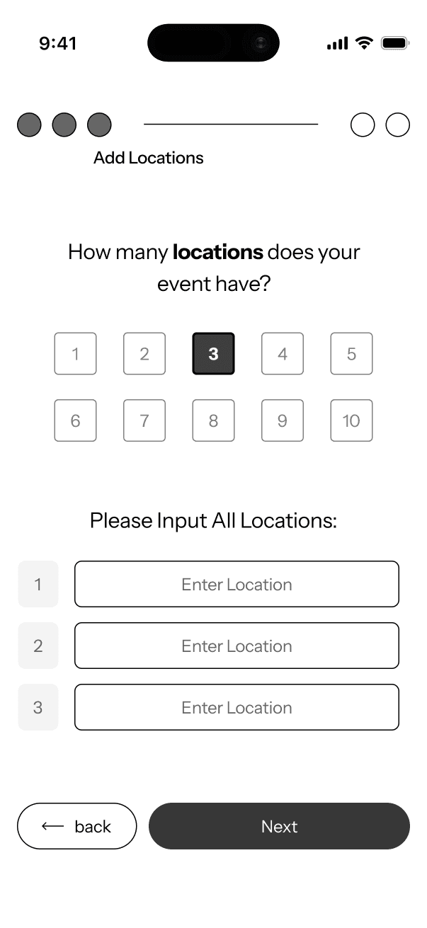
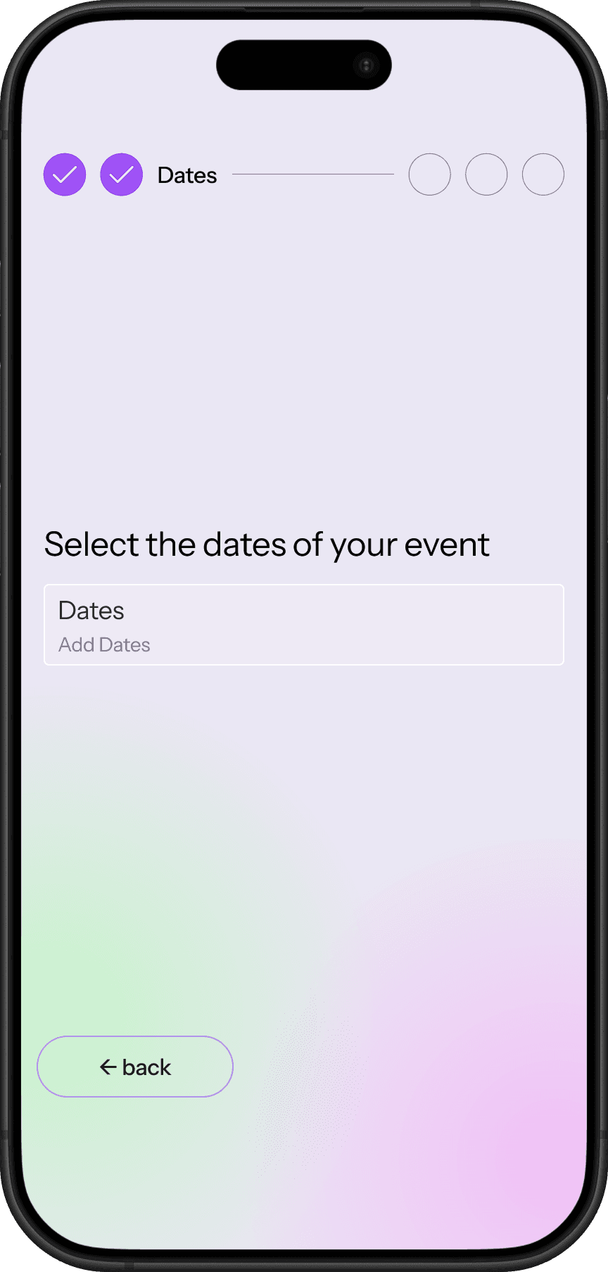
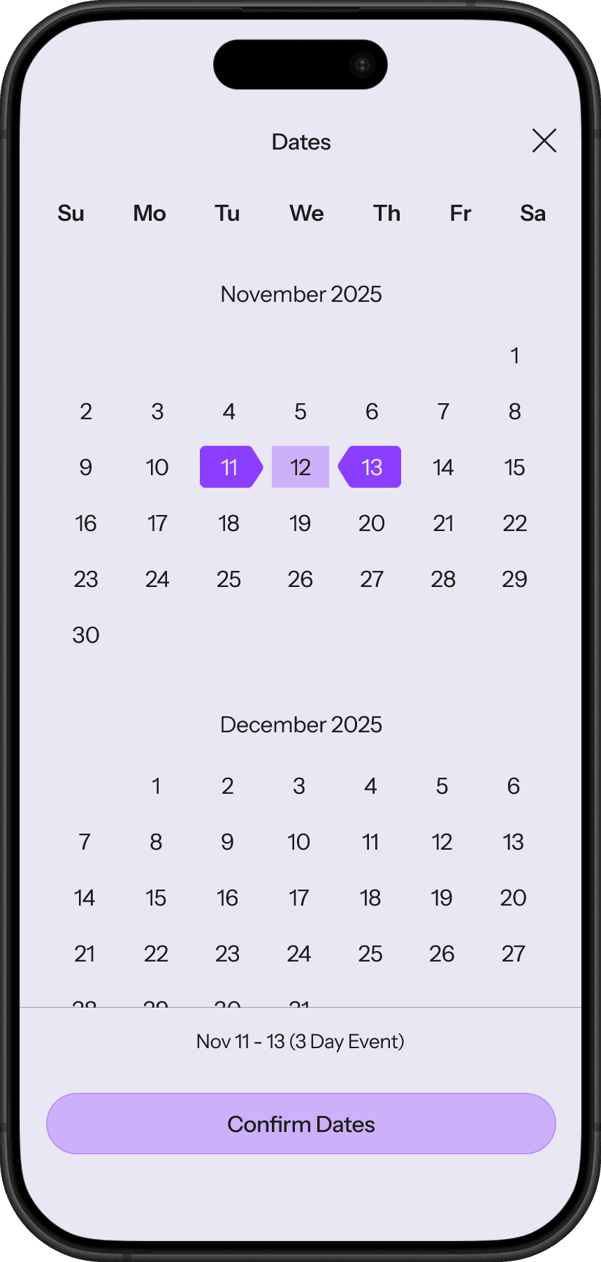
Date Options
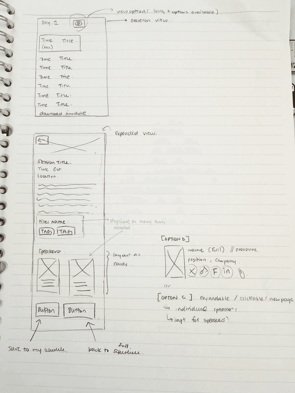
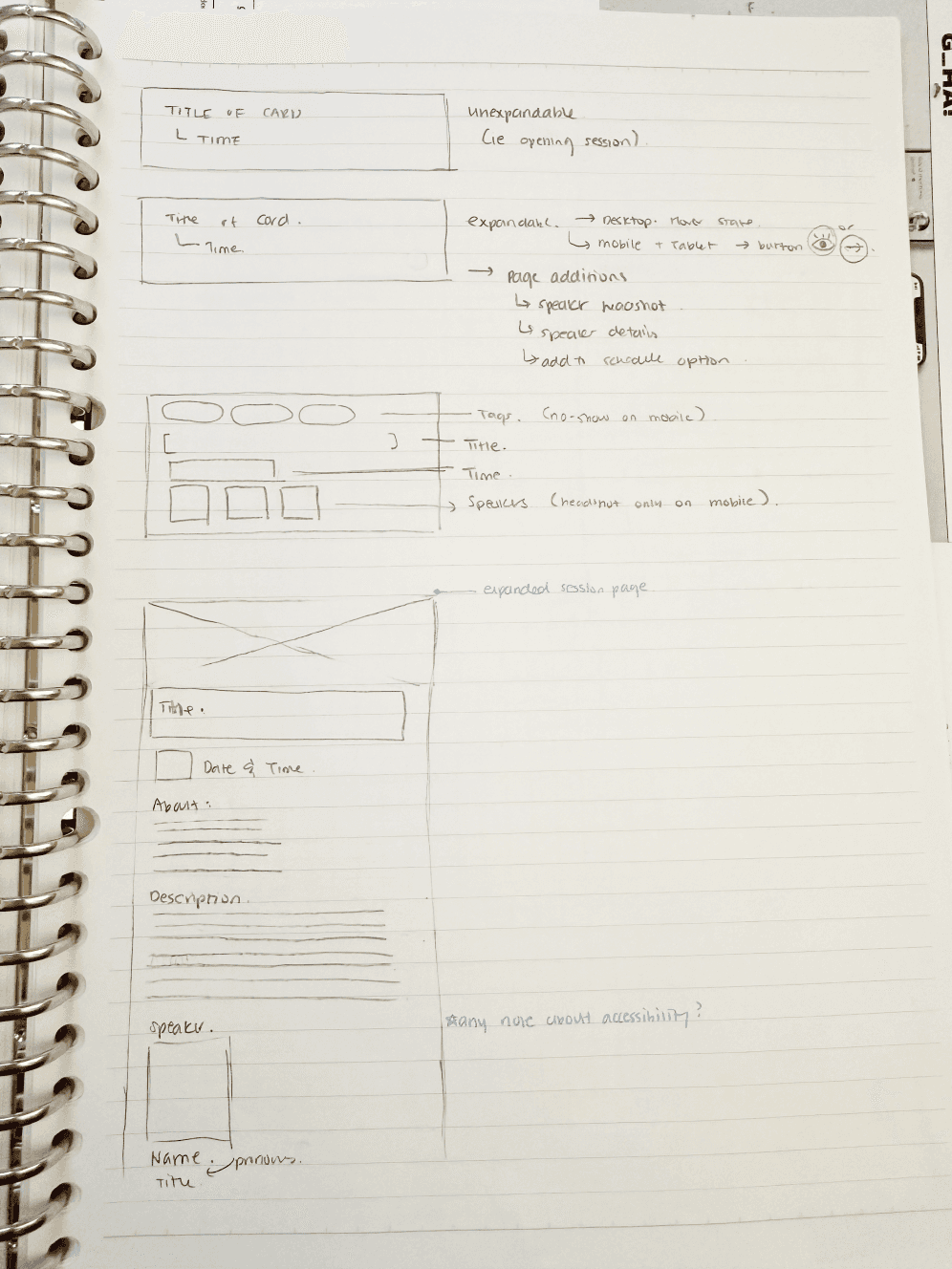
Schedule
Title
Time
Description
Speakers
Options to add more to the schedule
Navigation Bar:
Home and & Custom Editing Design option.
PUBLIC MODE
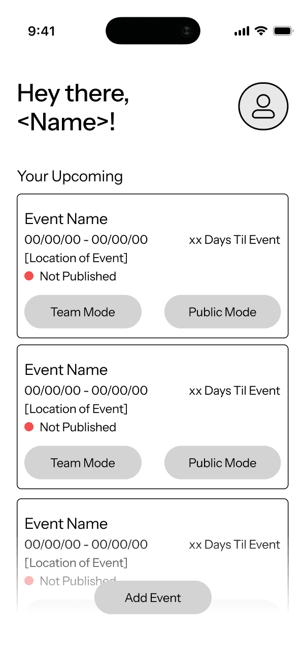
Overview:
Full view of all upcoming events
Setting/Profile Options
Individual Events:
High level overview of event (Key details from onboarding)
Countdown
Option to enter Team or Public Mode
Ability to add another event to the list
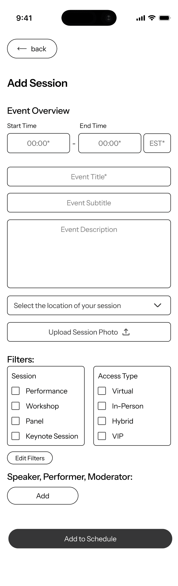
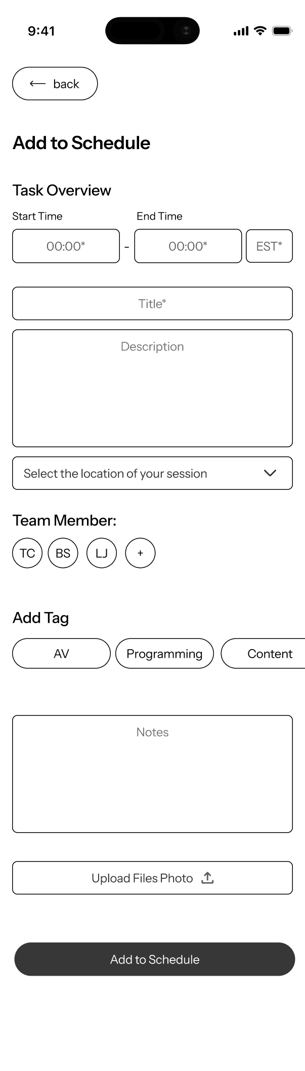
Session Addition
Input in order of importance and requirements (time, name, and description requirements)
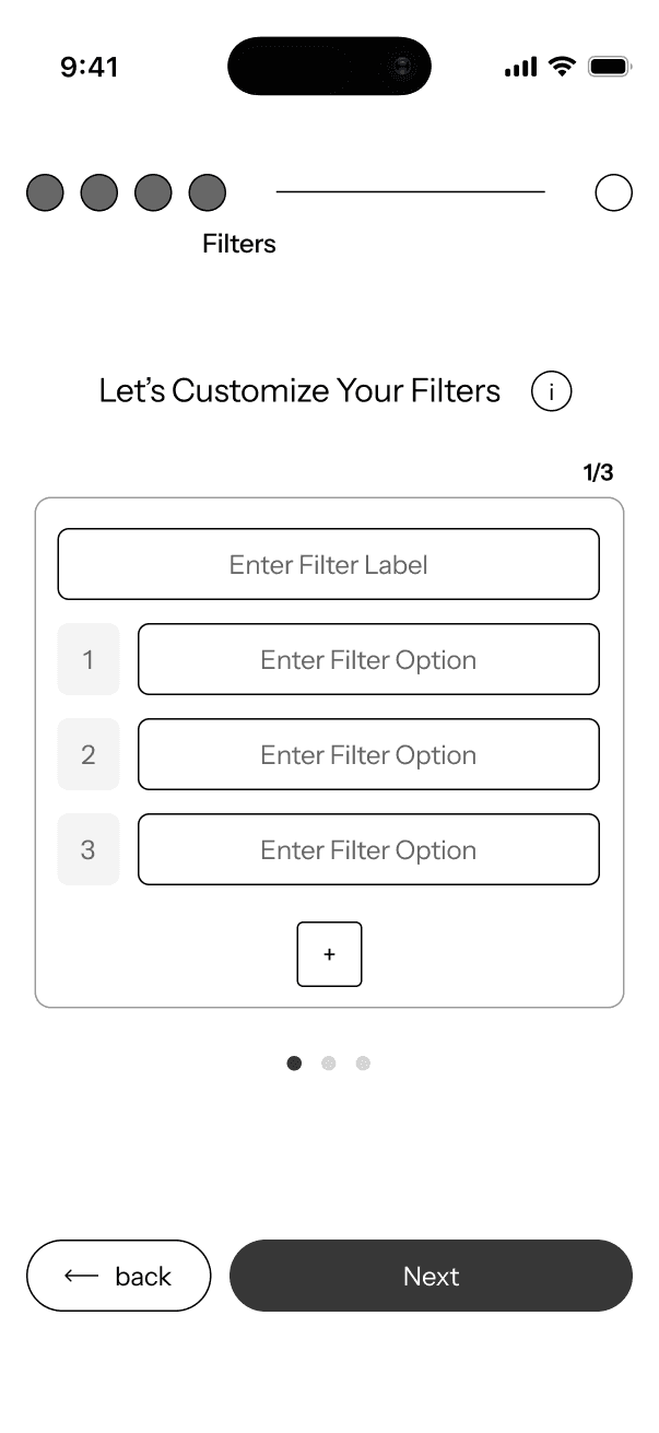
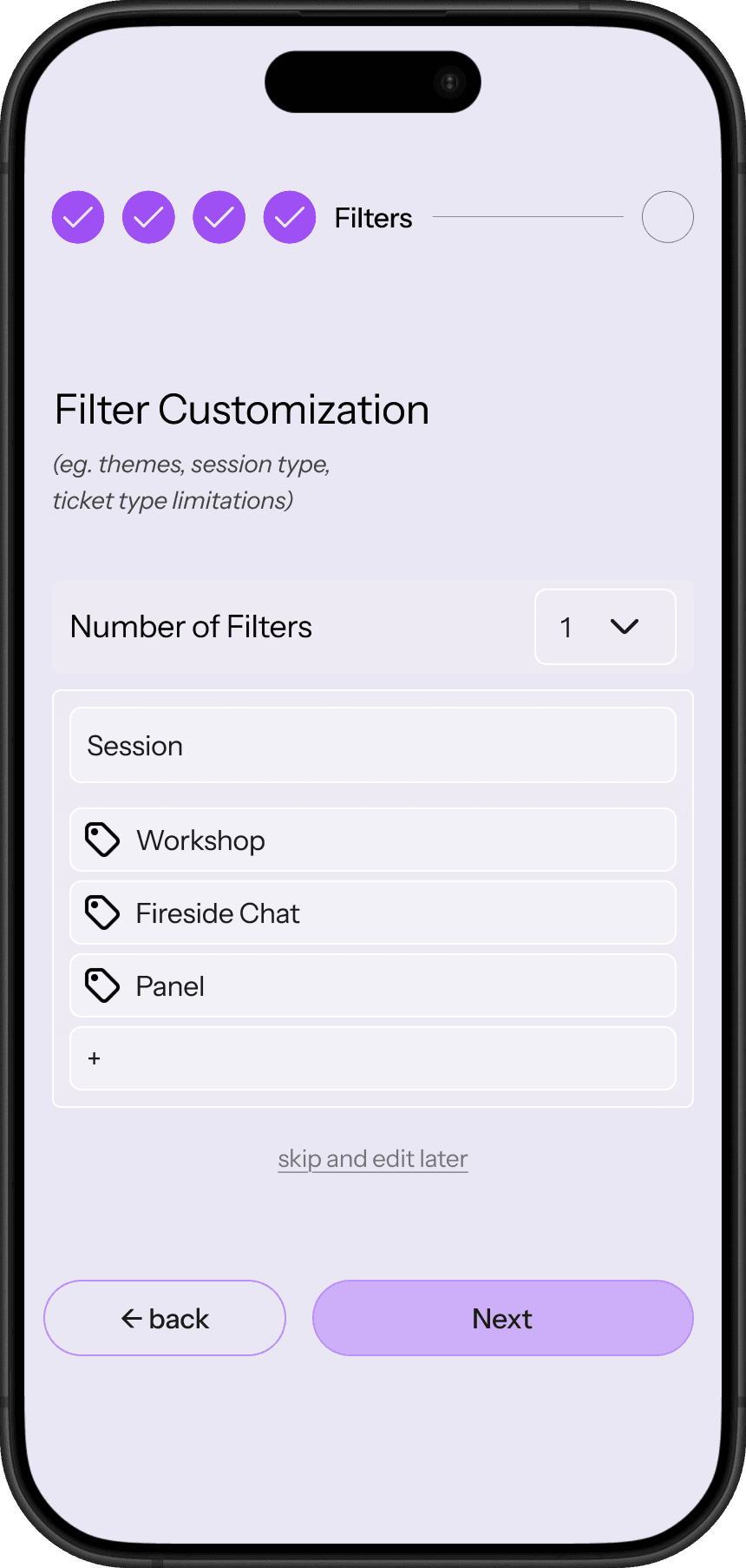
Filtering options
location
Filters added from onboarding session
Option to add a profile
PUBLIC MODE / TRANSITION STATES

TEAM MODE
Initial Usability Testing
Purpose: Examine if EventFlow was intuitive and easy to adopt.
Testing Group: 5 participants (with experience in event planning).
Goal: Identify gaps in functionality and interaction design.
During these sessions, I walked participants through key concepts and workflows, discussed their expectations, and observed how they interpreted the layouts and features.
While the overall concept was well understood, the testing revealed missing micro-interactions, unclear transitions between features, and opportunities to strengthen the system’s usability. These findings helped shift my focus toward refining core workflows and adding essential supporting features.
Key Findings
DASHBOARD
Overall:
Participants understood the dashboard as a high-level overview (underwhelmed).
Key Findings:
Limited ability to sort or filter events.
Option to view past events, especially if the platform is used repeatedly over time.
Insight:
The dashboard needs to better support event lifecycle management, not just active events.
PUBLIC ITINERARY
Overall:
The Public Facing Mode was the most intuitive
Key Findings:
Users clearly grasped the input → output relationship.
How are filters added, edited, and interacted with?
"What happens when you push publish?"
> Absence of a clearly defined final published itinerary view.
Insight:
While the concept was intuitive, users needed stronger confirmation of what the end experience for attendees would look like.
TEAM INTERFACE
Overall:
Team Mode generated the most questions, but also the most interest.
Key Findings:
Clearer interactions for adding, editing, tagging, and assigning team members.
"Are there teams?"
Multiple participants suggested a chat or notification feature to support real-time communication, especially for time-sensitive updates.
Insight:
Team Mode has the highest complexity and therefore requires stronger affordances, clearer hierarchy, and better communication cues to support collaboration.
Overall Takeaways
Stronger bridging features between modes
Clearer final-state views
Supporting micro-interactions that reduce friction and uncertainty
Fine tuning the Systems Architecture
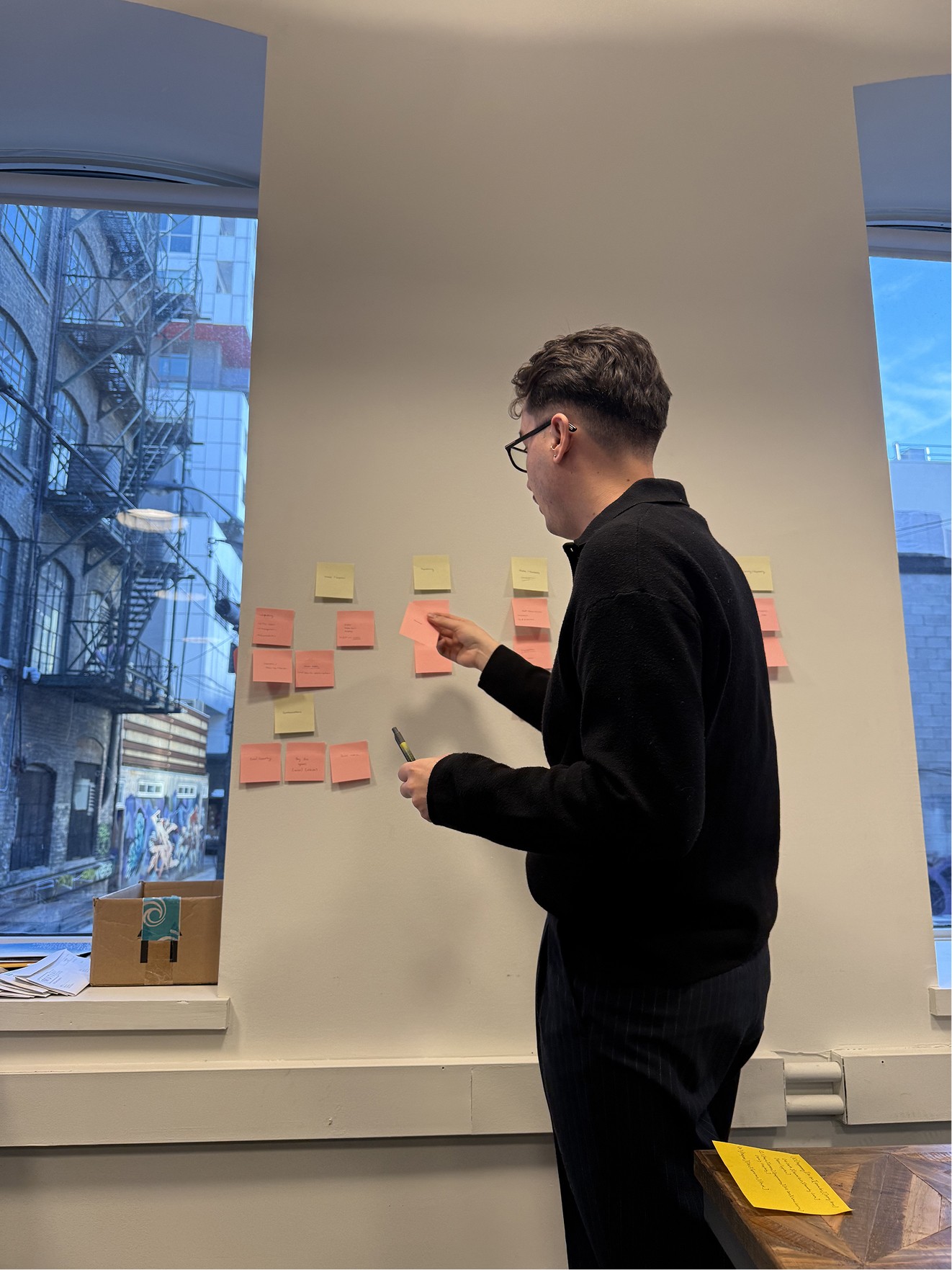
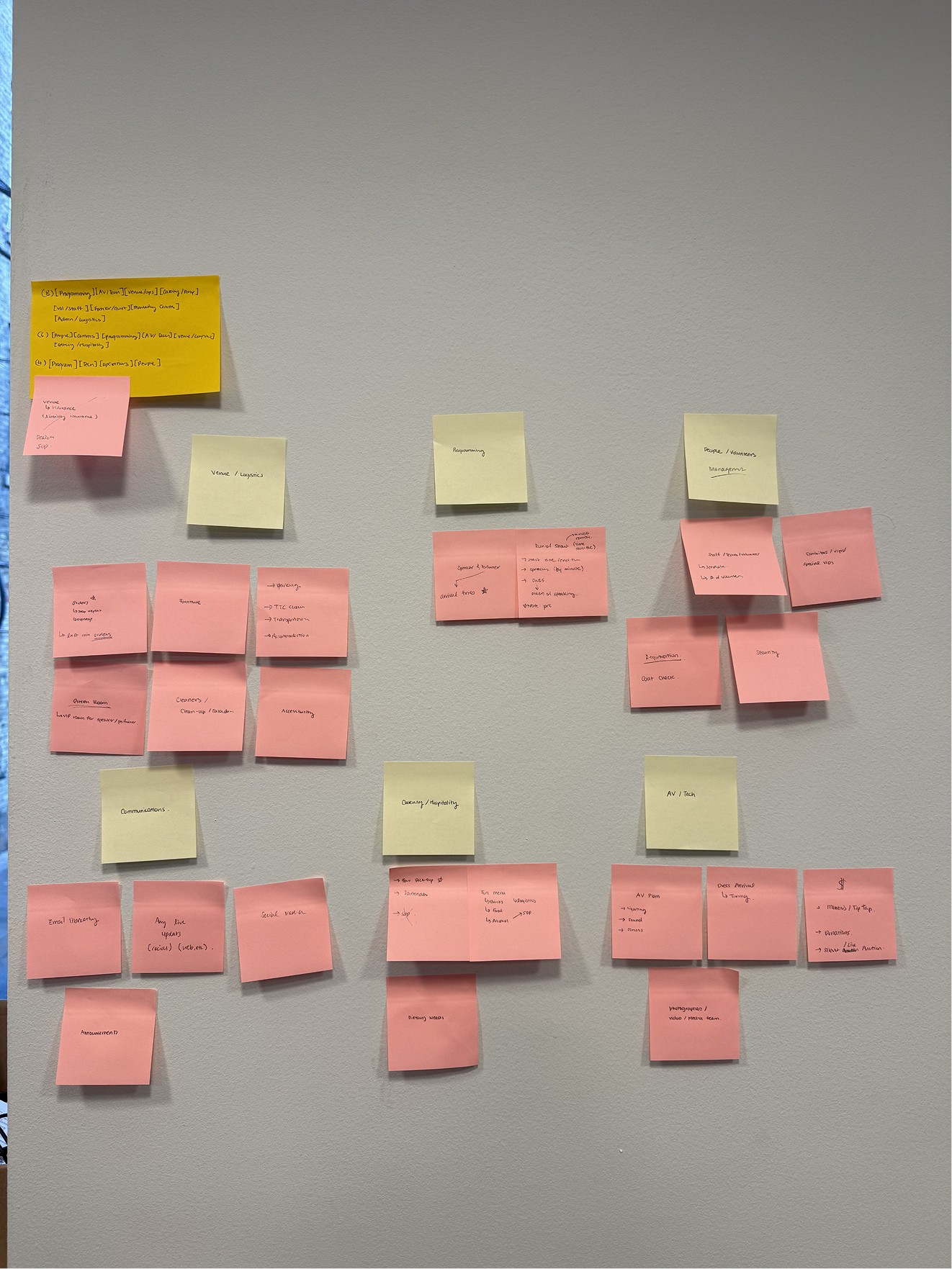
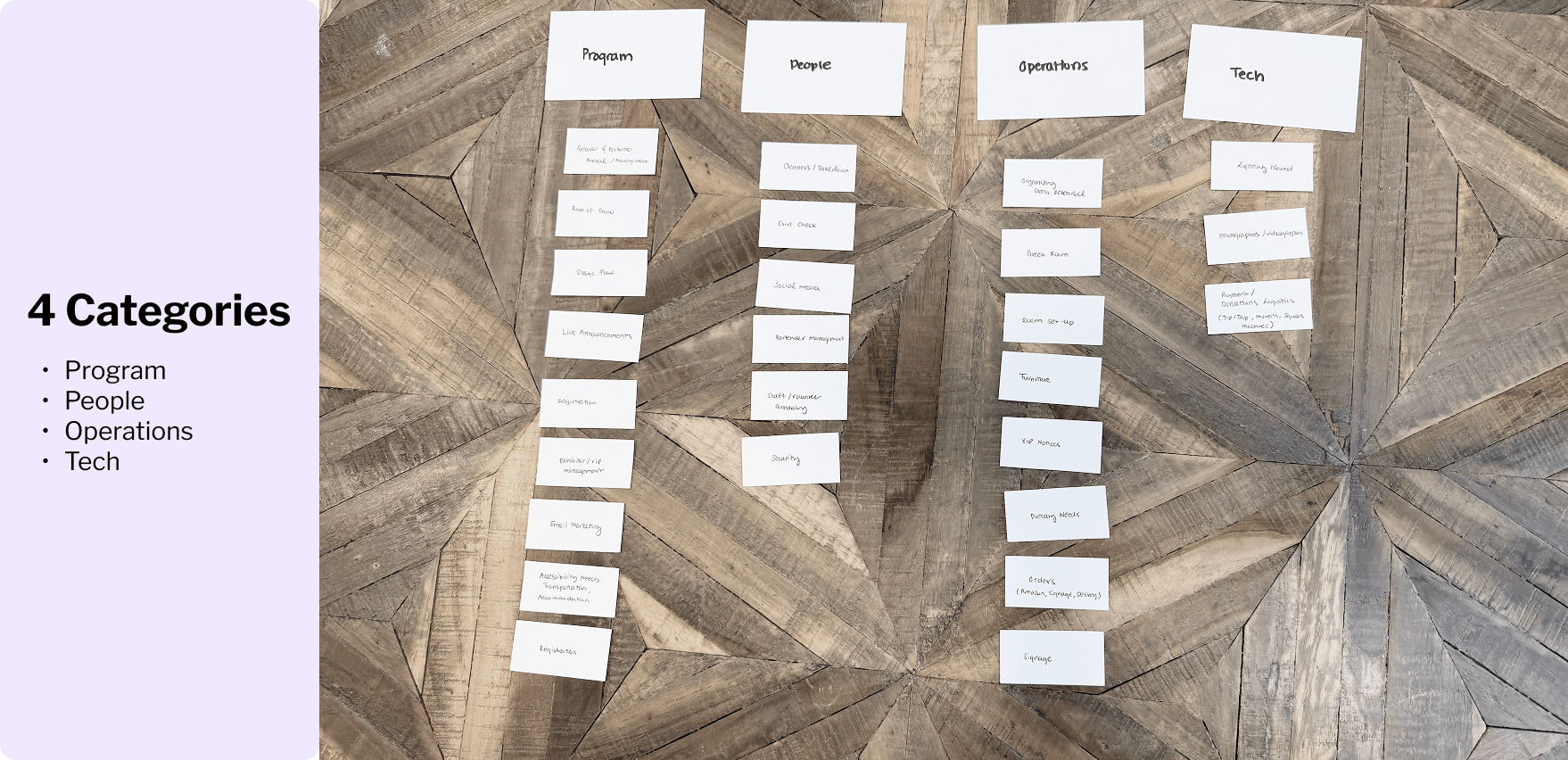
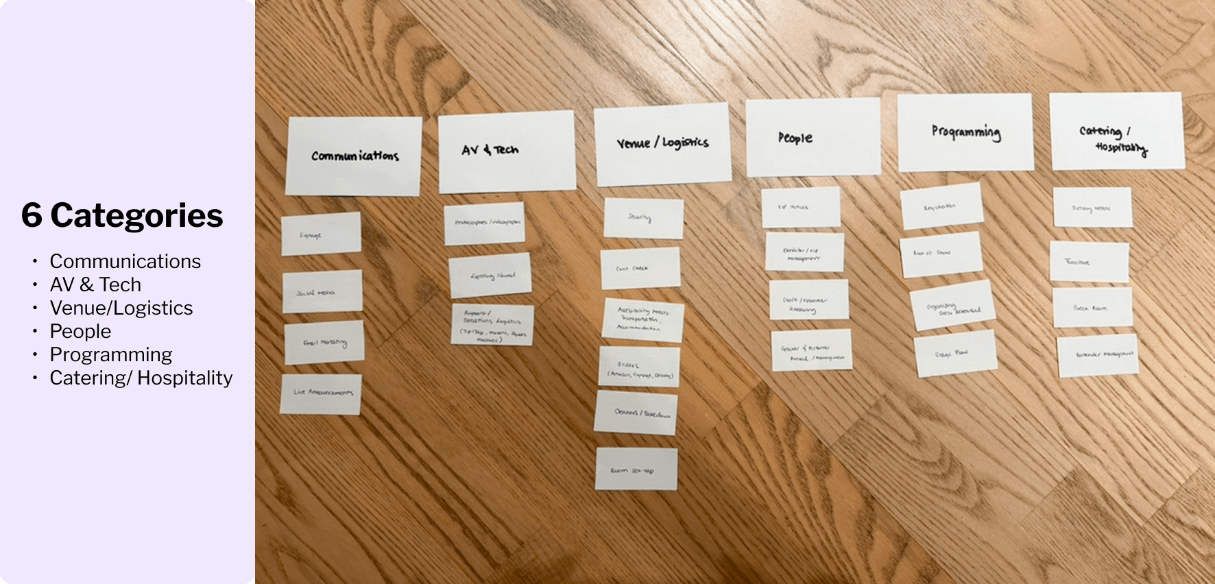
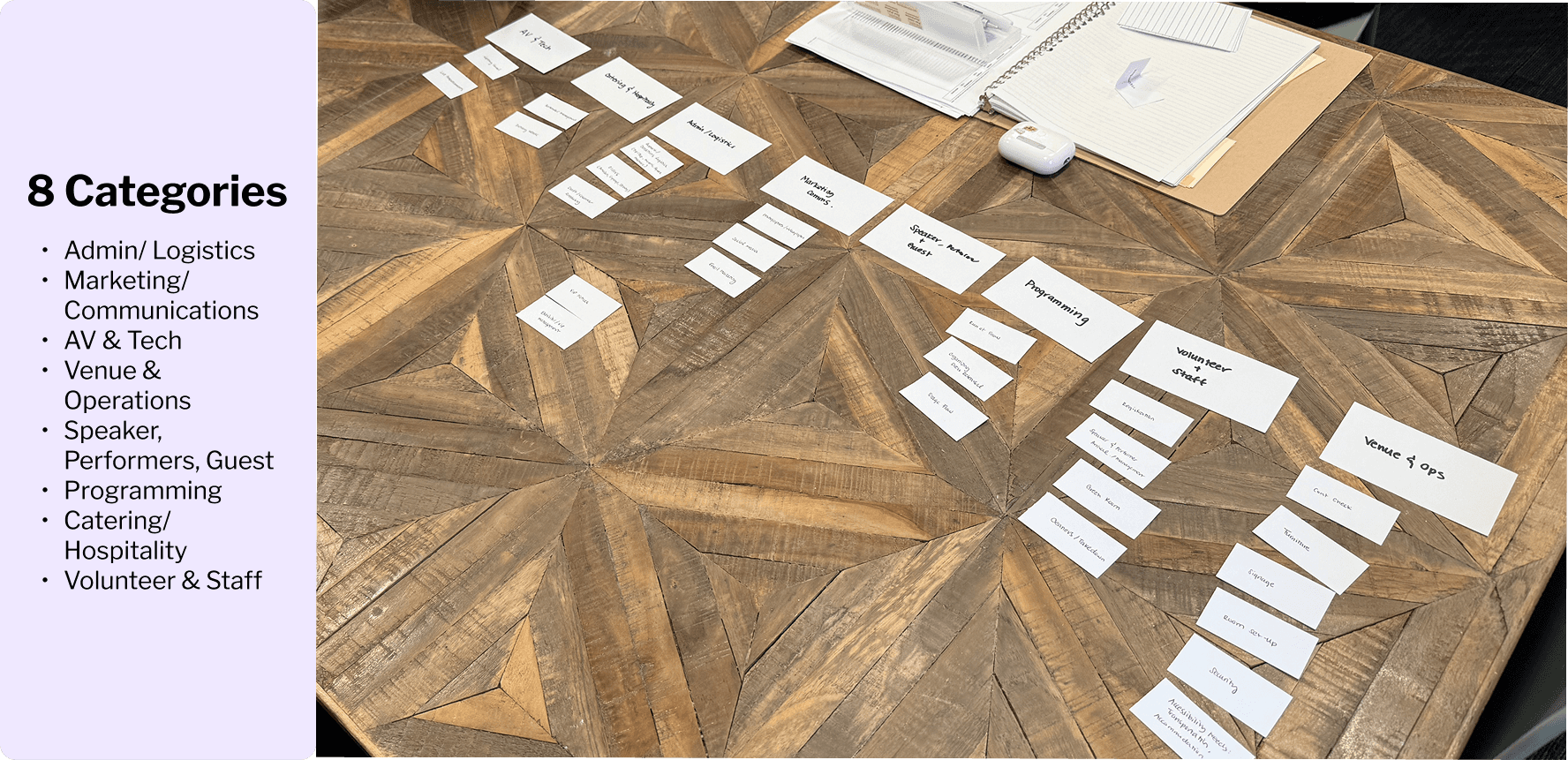
To reduce friction when organizing event-related tasks, I worked closely with an Events Manager to identify the types of tasks typically created during event planning. Together, we defined an initial set of high-level task categories based on real operational workflows.
I then conducted a card-sorting exercise with seven participants to evaluate how effectively different category structures supported task classification. Participants tested sets of 4, 6, and 8 categories, allowing me to assess the tradeoff between simplicity and clarity, as well as the impact on task selection speed and user confidence.
The results showed that six categories consistently led to faster completion times and lower hesitation, striking the best balance between structure and flexibility.
PART 5: VISUAL DESIGN & FINAL SOLUTION
BRINGING THE APP TO LIFE
LOGO


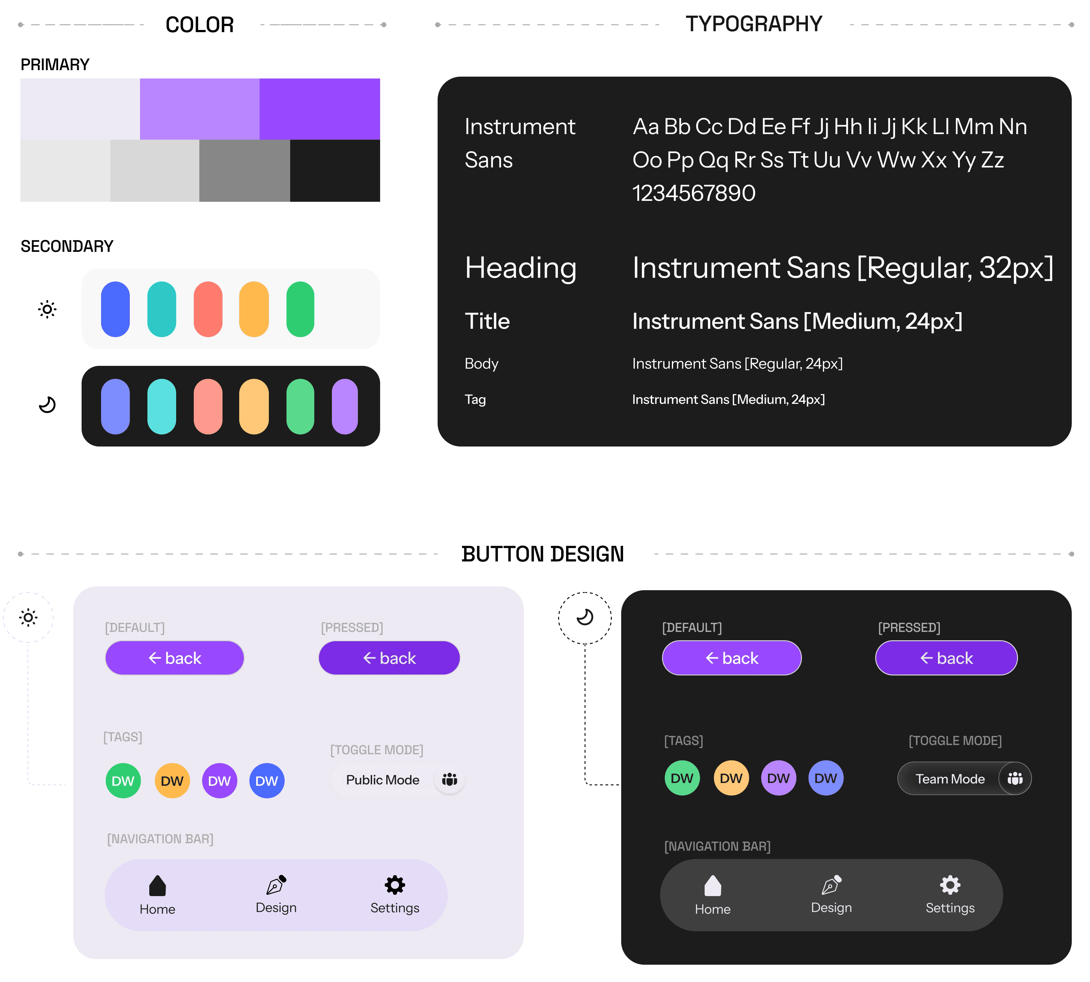
Branding & Visual Identity
I chose the name ‘EventFlow’ to reflect the core goal of the product: creating a uninterrupted flow between planning, coordination, and execution. The goal was the brand to emphasizes clarity and movement. The visual identity is intentionally minimal and flexible, allowing it to scale across different types of events without feeling overly rigid or prescriptive.
The UI tone is designed to feel confident, calm, and operational, prioritizing readability and hierarchy. A combination of light mode and dark mode is used strategically to help distinguish between different contexts of use. Light mode supports public-facing and attendee experiences, while dark mode is used for internal team workflows.
Subtle colour accents and consistent spacing help guide attention, support categorization, and reduce cognitive load, ensuring the interface feels intuitive even when managing complex, multi-layered event information.
EventFlow UI Kit
ONBOARDING
CROSS MODE SYNCING
TEAM MODE : ADDING TASKS
TEAM MODE : ADDING TEAM MEMBERS
PART 6: REFLECTION & NEXT STEPS
Final Usability Test
KEY INSIGHTS
Overall
Participants generally described the experience as simple and approachable; however, as workflows became more complex, areas of friction began to surface.
Team Page
Users found the interface simple but visually dense, highlighting the need for some kind of breakdown as users find their way to the dashboard or clearer hierarchy as task complexity increases.
Task Ownership & Visibility
As task lists grow, ownership becomes harder to track.
Potential solution: Introduce colour tagging allows teams to maintain an “All Tasks” view while quickly identifying responsibility.
Participants requested a “My Tasks” view to support personal task management within larger team workflows.
Publishing & Feedback
The Publish button caused confusion, as users were unsure when actions were finalized, leading to my decision to remove the manual publishing in favour of auto-save, reducing cognitive load while preserving cross-mode accuracy.
Itinerary Page
The public itinerary was consistently understood with minimal guidance.
Users requested the option to add additional filters to support more complex schedules without sacrificing clarity.
PRIORITY REVISIONS
My primary goal in this project was designing a scalable and intuitive team-facing system, focusing on how tasks, schedules, and content publishing could work seamlessly behind the scenes. The public-facing interface was not fully developed in this phase, but it remains a clear next step.
Moving forward, I would refine the user flow to make interactions more intuitive, expand features for customization and filtering, and improve interactive design elements, including loading times and screen transitions.
2026 ©
DANA